SiriusXM Entities / Case Study
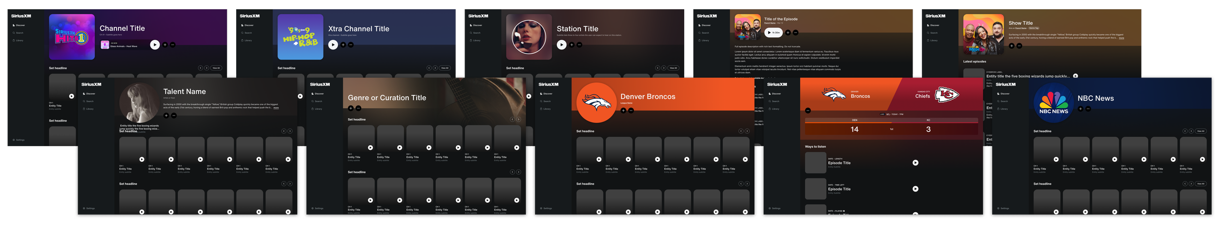
What looks like a simple page redesign was, in reality, a foundational rethink of how millions of users discover and engage with content across SiriusXM. I helped lead the redesign of entity headers across our 12 different entity page types (eg. channels, shows, artists, and episodes) — transforming a cluttered, monotonous system into a scalable, modular framework centered around playback and clarity. The project spanned dozens of design explorations, deep competitive analysis, and alignment across multiple layers of leadership, culminating in a vision we presented up to the VP level. The result was one of the most well-received launches in recent memory, praised internally for both its usability and visual polish, and validated through user testing as more intuitive, engaging, and action-driven.
my role: design lead (everything you see here, I had a direct hand in crafting in partnership with the PM)
I partnered closely with a legendary Product Manager, Tom, to shape the early strategy and direction of this work from the ground up. This wasn’t a case of executing against a predefined brief—we were defining the brief together. Through ongoing collaboration, we aligned on the core problems, pressure-tested opportunities, and crafted the narrative that ultimately secured leadership buy-in. I played a key role in driving design exploration, synthesizing insights from competitive analysis and user feedback, and co-authoring the story we presented up the chain, including presenting portions of the final deck myself.
sdsddsdsdsdsd
The Problem
Lack of hierarchy. Lack of inspiration.
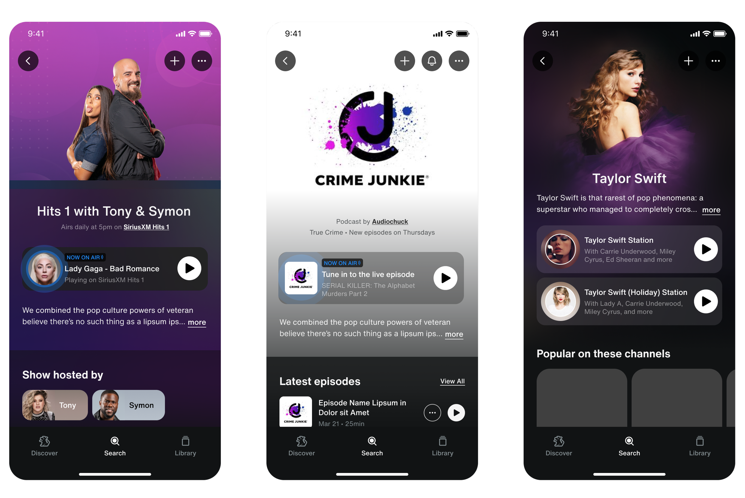
The existing entity headers were functional, but they lacked clarity, hierarchy, and purpose. Critical actions like play, save, and download were visually de-emphasized or difficult to interpret, while inconsistent layouts across entity types made it harder for users to quickly understand what they were looking at or what they could do next. The header—arguably the most important moment on the page—felt cluttered, visually flat, and disconnected from the primary goal of getting users into playback. As SiriusXM expanded its content types and features, the current system also showed clear limitations in scalability, making it difficult to introduce new actions or evolve the experience in a meaningful way.

Principles and approach.
We approached this as a foundational system redesign rather than a visual refresh. Our goal was to create a header that could clearly communicate what an entity is, what you can do with it, and guide you seamlessly into playback. We prioritized strong visual hierarchy, making the primary action unmistakable, while organizing secondary actions in a way that felt both discoverable and scalable. Consistency across entity types was critical—not for uniformity’s sake, but to build familiarity and reduce cognitive load as users moved through the app. At the same time, we designed for flexibility, ensuring the system could adapt to different content types and evolve as new features were introduced. Every decision was pressure-tested against real content, edge cases, and future scenarios to ensure the system would hold up beyond a single release.
A quick peek at competitive analysis.
These slides were part of our presentation deck to multiple layers of leadership, among others.
The exploration process.
Priority to “play”.
One of the most critical decisions was anchoring the header around a large, centered play button. While competitors varied widely in placement, our explorations showed that consistency and prominence mattered more than novelty. A centered play action created a clear focal point, reinforced the primary goal of the page, and scaled cleanly across entity types—even those without immediate playback.
—
Consistency in actions.
We also rethought how actions were exposed. Rather than trying to surface everything, we prioritized a small set of high-value actions and moved the rest into an overflow menu. This introduced a tradeoff between immediate visibility and long-term scalability, but testing showed users quickly understood and even expected the “…” pattern, especially when paired with clearer labeling and hierarchy.
—
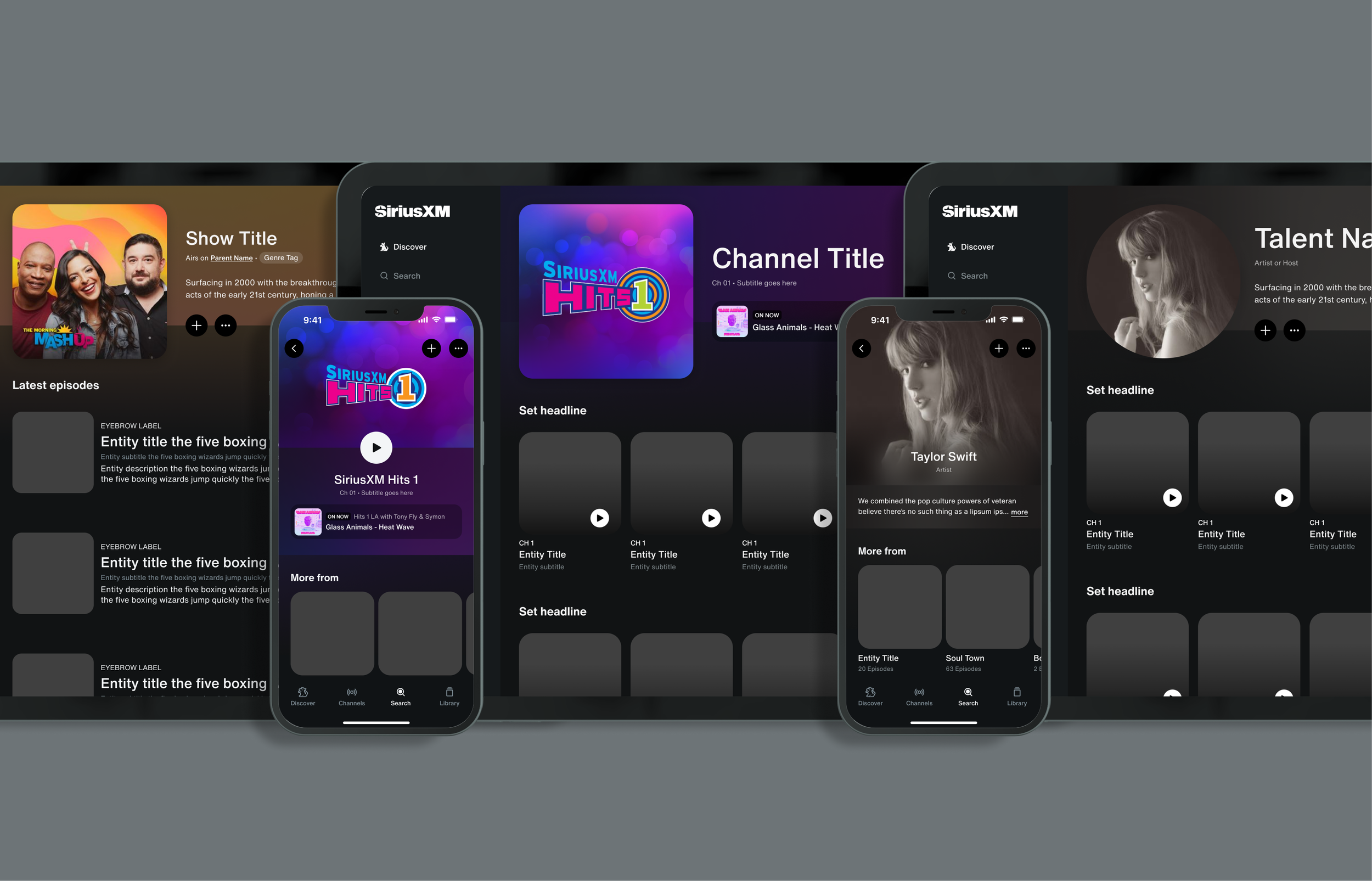
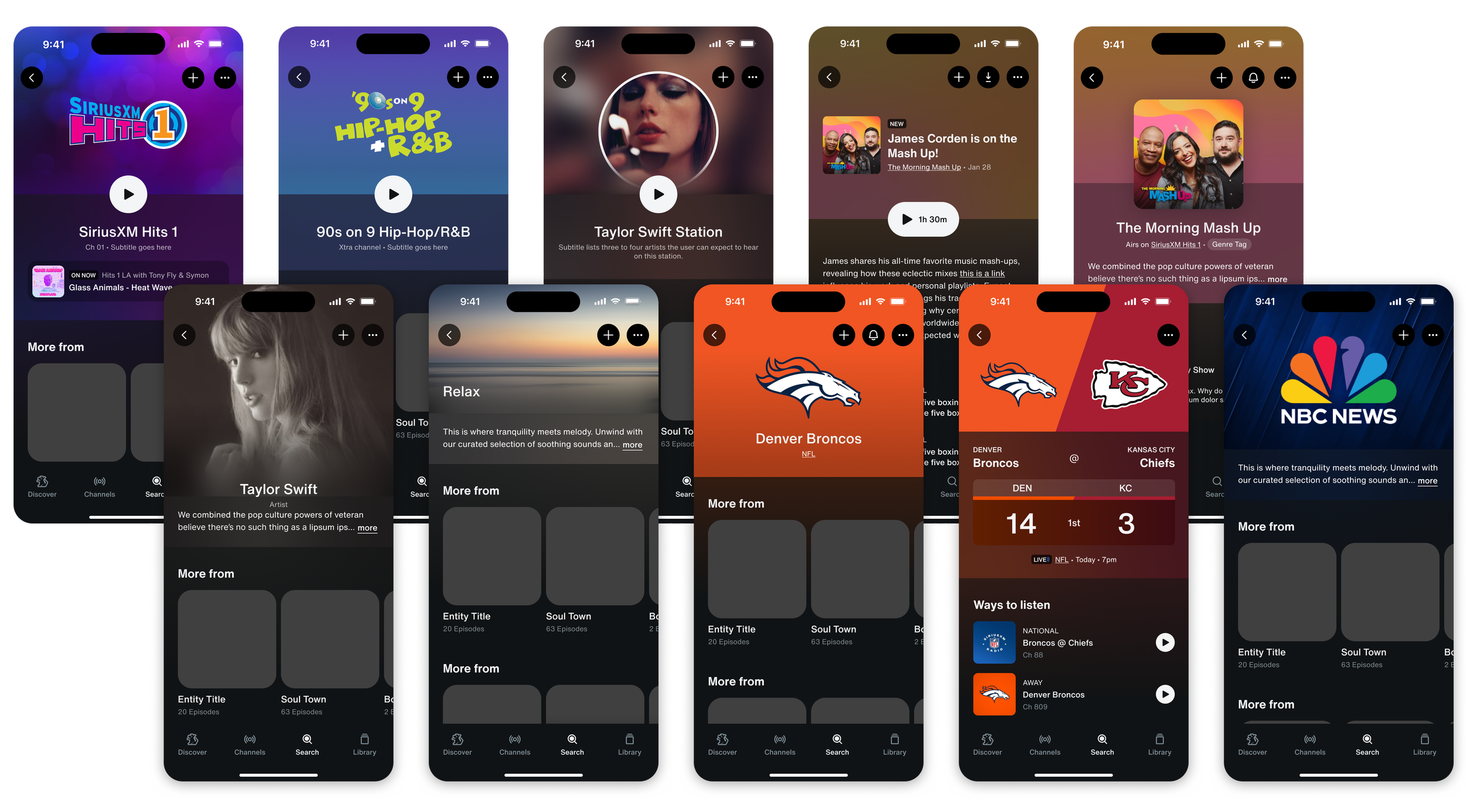
Cohesive system with thoughtful variation.
Another key tension was consistency versus optimization and differentiation. Early explorations tailored layouts to each entity type, which looked great in isolation but broke down as a system. We ultimately chose a more unified structure that could flex subtly per entity while maintaining predictable patterns across the app. The end result gave us a consistent system with enough variation to anchor each entity type as it’s own distinct type of page.
—
Concept. Pressure Test. Repeat.
Throughout the process, we continuously pressure-tested the design against edge cases—different artwork types, content lengths, and future feature scenarios—to ensure the system wouldn’t just work for today’s content, but hold up as the platform evolved. And while I don’t show them here, explorations in multitude were done across all platforms—mobile, tablet, web, and TV. Seen here is but a small fraction of mobile our experiments.
A few key slides from the leadership deck.
Designing for scale across platforms.
From the outset, this wasn’t just a mobile solution. The header system needed to scale seamlessly across mobile, tablet, web, and TV—each with its own constraints, interaction models, and viewing contexts. I designed and optimized the system across all platforms, ensuring the core principles held while allowing for thoughtful adaptation where needed.
On smaller screens, the focus was on clarity and touchability—making actions obvious and accessible. On larger surfaces like tablet and web, the system expanded to take advantage of space without introducing noise. For TV, the design had to work from a distance, prioritizing legibility, focus states, and simplified interactions.
The challenge was maintaining a cohesive experience without forcing a one-size-fits-all solution. By building a flexible, modular foundation, we were able to create a system that felt consistent across platforms while still respecting the nuances of each—ensuring users could move between devices without having to relearn how to engage with content.
The results.
We rolled out the new headers through a phased release on both Android and iOS, allowing us to measure impact while minimizing risk. Across platforms, the redesign drove meaningful improvements in engagement with core and secondary actions, while maintaining stability in overall listening behavior.
On Android, we saw a +1.7% increase in entity page visits, alongside a +14.5% lift in “Add to Library” and a +32.9% increase in notification engagement. On iOS, the updated design led to a +3.6% increase in play button CTR and an +18% lift in “Add to Library.” Importantly, key health metrics like total listening time and days active remained neutral, indicating the changes improved interaction without disrupting existing habits.
Beyond the numbers, the release was met with strong internal reception, with leadership calling it one of the most compelling feature launches in recent memory. The work not only improved usability in the short term, but established a scalable foundation for future features and content types across the platform.
Final reflections.
This project reinforced for me that some of the most impactful work isn’t about introducing something entirely new—it’s about reshaping the foundation things sit on. What began as a “header redesign” quickly revealed itself as a systems problem, where small decisions around hierarchy, consistency, and interaction patterns had outsized effects on usability and scalability.
It also highlighted the value of tight product–design partnership. Working closely with PM from the earliest stages allowed us to define the problem clearly, move quickly through ambiguity, and build a narrative that resonated from individual contributors all the way up to executive leadership.
If I were to push this further, I’d be excited to explore how the header could become even more dynamic—adapting to context, content type, or user behavior in ways that feel responsive rather than static. But more than anything, this project set a new baseline—one that future features can build on, rather than work around.