
SiriusXM Call-In / Case Study
One would think a simple button would be a simple feature ask – alas, enter the Call-In feature at SiriusXM. As a key opportunity to lean into a differentiator of SiriusXM over other audio streaming competitors, this project brought a huge leap in ease of calling into a live radio show while streaming through the app. From 0 to 1, this was one of the quickest turnarounds we’ve ever had at SiriusXM and with a touch of delight, the final result surpassed our expectations.
my role: design lead
Many projects at SiriusXM were about as fast moving as a snail pulling a loaded train, but this wasn’t one of them. In a matter of weeks we went from project conception to completion. Perhaps that’s what makes it one of my favorites! Yeehaw!
sdsddsdsdsdsd
The Problem
Calling in to a live show is about as easy as using a rotary phone.
When a live host prompts a listener to call in, users have to hunt for the number or memorize it as it’s read out, exit SiriusXM app, open their phone app, then fumble as they type in 10 digits.

Some initial learnings.
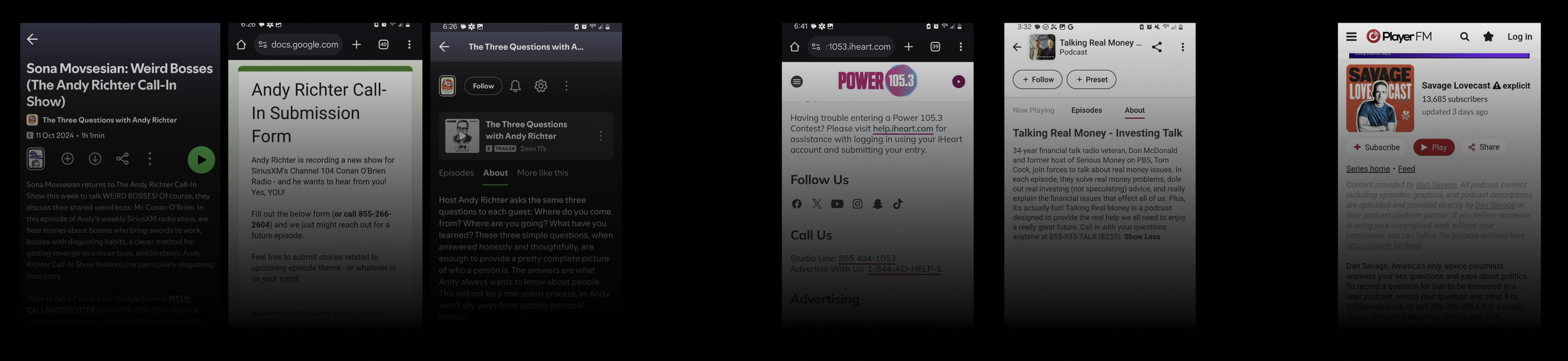
When looking at competitors, none addressed this problem head-on.
Most, if not all, simply placed the phone number in the description to the episode or show – much like we were currently doing.
Our users often listen in the car, and our current path to interaction was far too much to ask.
Many SiriusXM listeners are very habitual and many actively avoided high-friction tasks.
Our current treatment for phone numbers got mega lost on the page.
As immediate as “call in now” prompts are curing a live show, often times the number would disappear before a user could find it.
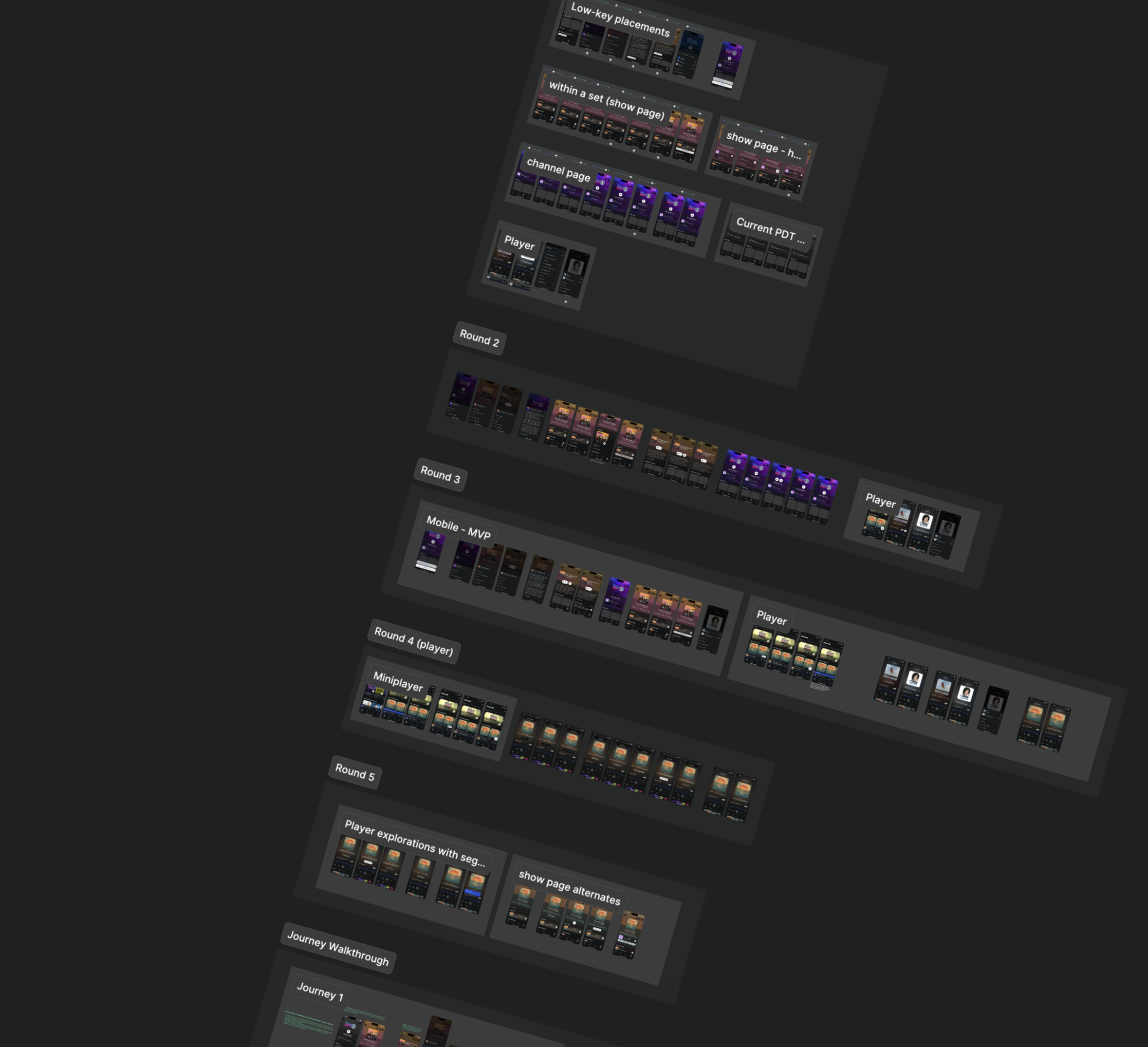
The exploration process.
Rapid exploration.
Over the course of a few weeks, I led the team through multiple rounds of explorations. Considering several different user journeys and priorities alongside business and tech feasibility as we drove from an abstract concept toward concrete solutions.
—
Correlation identification.
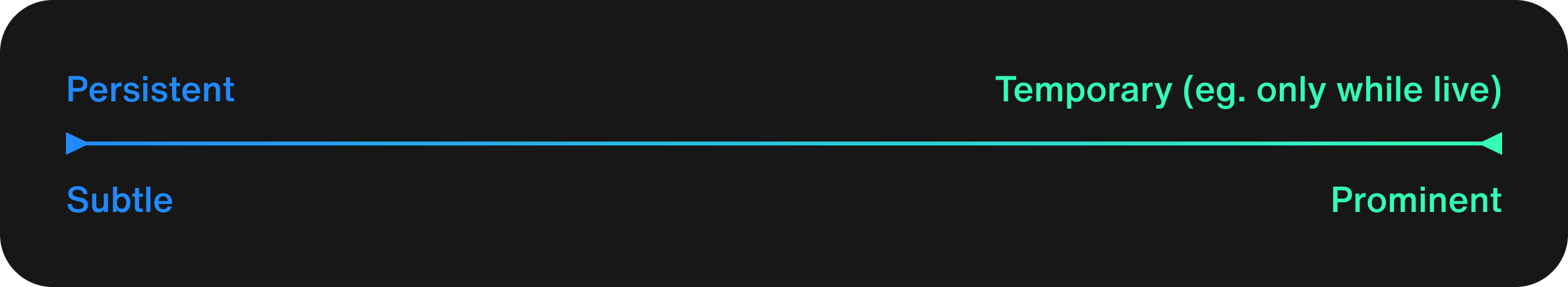
Through my exploration process, I was able to help the team identify a key correlation consideration that we used as our guiding light when narrowing to a solution. The more persistent the call to action was in any instance, the more subtle it needed to be. The more temporary, then the more prominent it needed to be.
—
Constraints and collaborations galore.
Around nearly every turn was another wall, another reason an approach couldn’t work. The bin quickly filled with abandoned concepts as we quickly iterated, tested with users and aligned with multiple stakeholders as we neared our delivery deadline. Too in-your-face, or not in-your-face enough. Too complex to build, or stepped on areas that clashed with other future projects. The concept shown here, for example, got kiboshed because that location is where the current now-playing segment name was displayed and would’ve been lost to the user once a new song or segment started playing, even if the show was still accepting call-ins.
The final solution.
Sometimes the most intense of roads lead to the most simple of solutions. This was one of those cases.
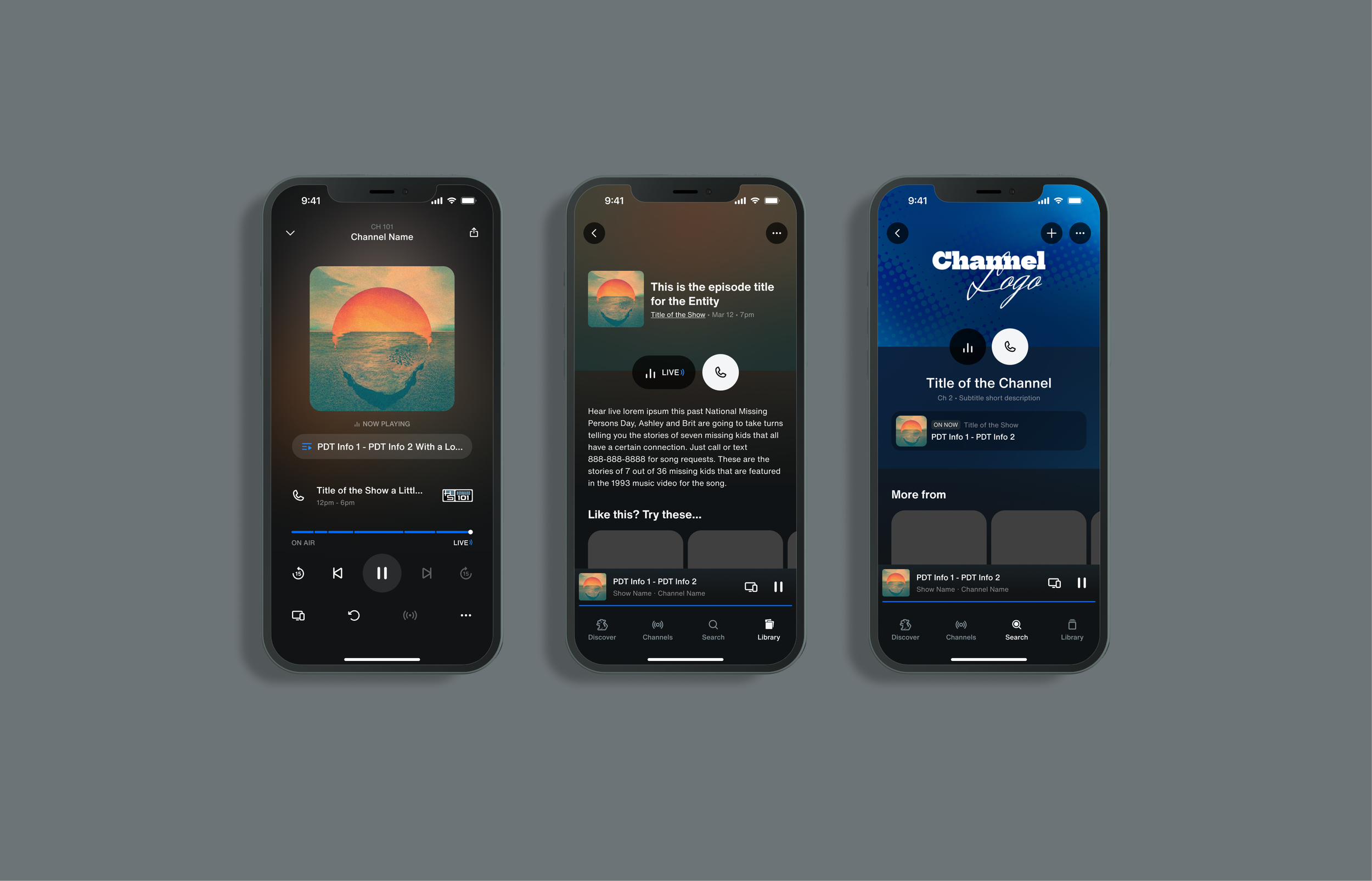
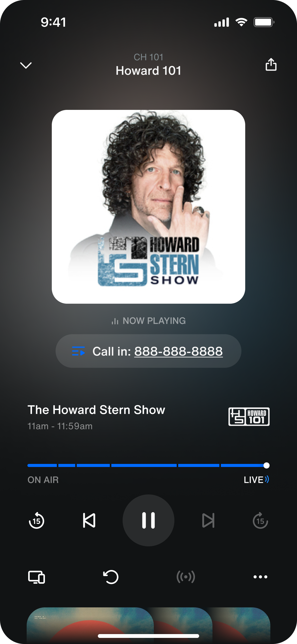
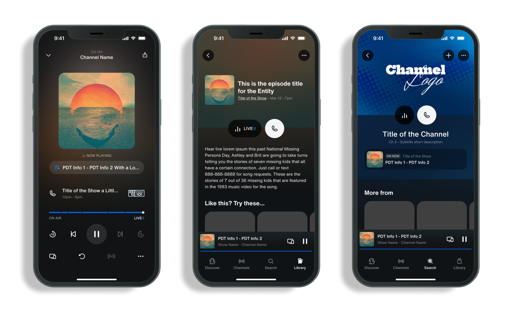
We implemented a simple phone icon CTA in three different locations, to accommodate where our users were most likely to already be while listening to the show.
In the player, the icon tested the best located right next to the name of the show. Most users understood the meaning with the added context and proximity of the two elements.
On the channel and episode pages, we realized the CTA only became relevant if the user was actively listening to the show, so as to not distract from the primary PLAY BUTTON CTA, we designed it such that the CALL IN CTA slides in only once the user hits play or is already actively listening to the show, further reinforcing the relationship of the feature with what they are hearing.
The results.
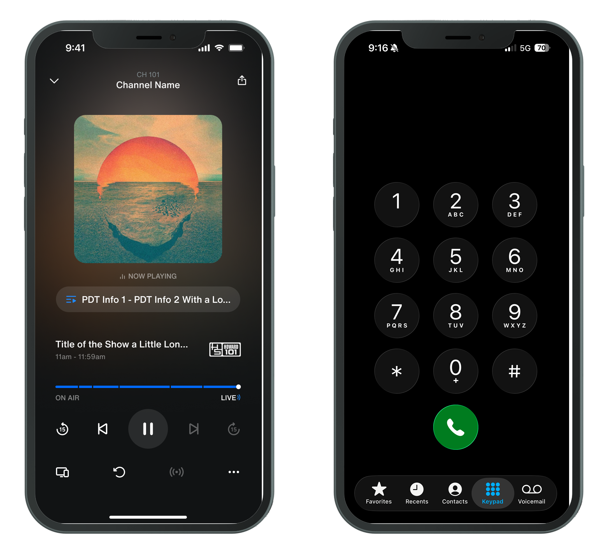
In the end, we reduced friction from a multi-step manual dialing process to a one-tap entry experience, increasing call initiation by 3x, which far surpassed our expectations.
Old flow:
Listen → remember number → leave app → open phone → type → call // 10-25 seconds + human error risk
New flow:
Listen → tap → call // 1-2 seconds